| Element | Property | Color token |
|---|
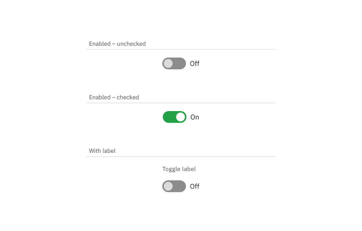
| Label | text color | $text-secondary |
| Toggle text | text color | $text-primary |
| Off background | background-color | $toggle-off |
| Off handle | background-color | $icon-on-color |
| On background | background-color | $support-success |
| On handle | background-color | $icon-on-color |
| Checkmark | fill | $support-success |
Examples of inactive, inactive hover, and active states for a toggle
| State | Element | Property | Color token |
|---|
| Focus | Toggle | border | $focus |
| Disabled | Label | text color | $text-disabled |
| Toggle text | text color | $text-disabled |
| Toggle background | background-color | $button-disabled |
| Toggle handle | background-color | $icon-on-color-disabled |
Toggle labels should be set in sentence case, with only the first word in a
phrase and any proper nouns capitalized, and no more than three words.
| Element | Font-size (px/rem) | Font-weight | Type token |
|---|
| Label | 12 / 0.75 | Regular / 400 | $label-01 |
| Toggle text | 14 / 0.875 | Regular / 400 | $body-compact-01 |
| Element | Property | px / rem | Spacing token |
|---|
| Toggle small | height | 16 / 1 | – |
| width | 32 / 2 | – |
| Handle | height, width | 10 / 0.625 | – |
| Label | margin-top, margin-bottom | 16 / 1 | $spacing-05 |
Structure and spacing measurements for small toggle | px / rem
| Element | Property | px / rem | Spacing token |
|---|
| Toggle medium | width | 48 / 3 | – |
| height | 24 / 1.5 | – |
| Handle | height, width | 18 / 1.25 | – |
| Label | margin-top, margin-bottom | 16 / 1 | $spacing-05 |
| Toggle text | margin-left | 8 / 0.5 | $spacing-03 |
Structure and spacing measurements for medium toggle | px / rem
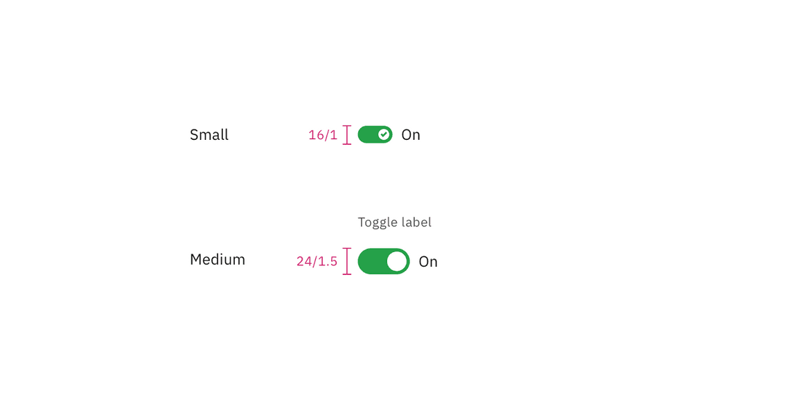
| Size | Height px / rem |
|---|
| Small (sm) | 16 / 1 |
| Medium (md) | 24 / 1.5 |
Toggle sizes | px / rem


